
Five Weeks.
One Project.
One Designer.
Overview
Managing group schedules can be overwhelming. This project focuses on creating a seamless, user-friendly solution to simplify scheduling and improve overall usability.
My Role
As the sole designer, I led the entire UX process—from research and problem definition to wireframing and prototyping—crafting an intuitive experience


Quick Note: This case study taught me one of the most important lessons in design — that simplicity wins. While I know the final UI/UX isn’t perfect, I learned how over-designing can get in the way of clarity, and how empathy and focus make for stronger solutions. Constraints around time and user access made it tough, but sharpened my thinking for the next project.
02 KEY CHALLENGES
Challenge 1: Managing Project Timeframes Efficiently
On busy days, juggling multiple responsibilities and deadlines can be overwhelming, making it difficult to stay on track.
Solution:
I introduced a Time Blocking System to allocate focused time slots for tasks. This structured approach helps you stay organized and productive without feeling overwhelmed.
Challenge 2: Organizing Quality Family Time
Coordinating family time is tricky when everyone’s schedules differ and change weekly.
Solution:
I applied a Shared Calendar & Weekly Sync Strategy:
-
A shared digital calendar to track everyone’s availability
-
A quick way to check-in to align on upcoming plans
-
Flexibility for last-minute changes
Challenge 3: Navigating Overwhelming Calendars
Traditional calendars can be visually overwhelming, and for those with dyslexia or other challenges, they can feel discouraging.
Solution:
I explored Accessible & Visual-Friendly Scheduling Tools to be more inclusive and intuitive:
-
Using color coding and icons for quick recognition
-
Enabling voice notes and reminders for easier tracking
-
Implementing simplified daily view widgets for better clarity
Challenge 4: Losing Track of Time on the Go
A fast-paced lifestyle makes it easy to get lost in the moment and miss important commitments.
Solution:
I leveraged Smart Reminders & Location-Based Alerts:
-
Setting gentle reminders before key events
-
Using memo alerts from those sharing the account
-
Allocating buffer time between activities for better time management
03 UX DESIGN: PERSONA
Omar Alexandria
Age:
Education:
Hometown:
Family:
Occuptation:
42
BA in Graphic Design
Barcelona, Spain
Wife & 2 Children
Remote Graphic Designer

Omar wants to make sure he doesn’t miss out on precious moments with his family. He wishes there was a more intuitive way to manage time with them.
Goals
-
Prioritizing time-management to tackle procrasination in the household
-
Plan more romantic vacations with his wife and quality time with his kids
-
Manage and keep track of his kids schedules while on business trips
Frustrations
-
Difficult organizing an efficient schedule
-
Focusing on too many things at once and losing track of time
-
A calendar is overwhelming due to dyslexia
“My journey in life led me to starting my own freelance business, so I may be more present with my family.”
Problem statement:
Omar is a busy business owner who needs a more efficient way to manage his family's schedules because it will make it easier to make more plans with the family, and keep track on the family's time management.
Hypothesis statement:
If Omar uses the family time-management app for an effecient way to keep up with the family then the family can have a way to involve themselves to create an interactive effort to keep up with each other.
User story:
"As a business owner who works long hours remotely, I want to be able to easily manage my family's busy schedule,so that I may easily plan more quality time to spend with them."
Goal statement:
Our app helps users manage family time efficiently by seamlessly integrating the families priorities in one place. This simplifies achieving shared family goals and managing more quality family time.
We'll measure success by analyzing schedule management efficiency and the achievement of time-sensitive family goals.
04 UX DESIGN: PROCESS
Competitive Audit
To inform strategic design decisions, I conducted a focused competitor audit of leading transit apps. This evaluation uncovered usability patterns, strengths, and gaps that shaped key design opportunities for our product. The findings directly influenced feature prioritization and user flow improvements.
"HOW MIGHT WE" BRAINSTORMING
Goal: Use "How Might We" to ideate
How might we make keeping track of schedules a fun experience with family or a group?
How might we create a way that simplifies user flow managing a schedule?
How might we make schedules keep up with the user instead?
How might we make it easier to recover from missing a plan or schedule?
How might we make a way for users to use the app without opening it?
How might we make the use of a schedule planner less tedious or stressful?
How might we make using a schedule plannermore playful?
How might we use AI to assist a user managing their schedule?
RAPID SKETCHING ("CRAZY EIGHTS")
Goal: Use Rapid Sketch to ideate for the problem statement
Problem statement:
Omar is a busy business owner who needs a more effiecient way to manage his family's schedules because it will make it easier to make more plans with the family, and keep track on the family's time management.

USER FLOW MAP
Primary User Task: Users easily manage family time, connect priorities, and achieve goals simply from the homepage / widgets.
Open
App
Welcome Page
User logs in or signs up to start a family account
Home Page
Click button on home page to send link requests for family to join family account
All family members share family account and list out personal plans from home page
User and family interact with each others schedule on home page
Need help installing our widgets?
Y
N
Widget Guide Page
Follow guide to set up or update widgets for home and lock screen for an interactive schedule
Information Architecture & Storyboard
This simple, focused site map outlines the app’s core structure and navigation, emphasizing only essential features to support user needs and minimize complexity. The storyboard demonstrates how a user may experience it.
05 DESIGN DISCOVERY
LOFI PROTOTYPE
There are already many family time-management apps and built-in smartphone tools. I didn't want this app to be just another one. My goal is to create an efficient system that minimizes time spent on the app by using widgets and the homescreen as the main function.


06 DESIGN CONCEPTS
01 Home Page
Through user research and feedback, I found that people prefer simple, intuitive designs. While some time-management apps have great features, they can be tedious to use. The homepage is the only place the user needs to be when accessing the app.
The app lets every family member send memos from the homepage, visible through notifications and the memo widget.
View the current day's schedule here, organized by icons, timestamps, labels, and short descriptions for easy navigation and adjustments.
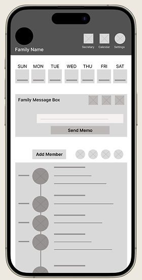
Users can easily navigate through the current week.
Add new users to the family account with the "Add Member" button. Current users will have profile pictures listed here. Click on profile pictures to view each member's personal schedule below.
01 Scheduling Page
Simply swipe down the screen or press the "X" icon to go back to the home screen.
Clicking a default or existing plan icon in the daily schedule section directs you to that plan's settings. The scheduling page is designed to be minimalistic and compact, avoiding unnecessary scrolling and tracking progress easily.
Click the "AI Secretary" chatbox, explain your plans, then it integrates it to the schedule.
From my research, I found that fewer, more effective features reduce clutter, making planning less overwhelming and more efficient.

You can choose a color for your plan, aligning with its priority or category.
Every plan can include detailed information, subtasks, links, or phone numbers, etc.
01 Add Member Page
This simple and intuitive layout maximizes minimalism and empty space, thereby creating visual appeal. Showcasing the whole family this way is a familiar style that allows for less words to be needed.
Adding a back button in the corner is familiar, and having one at the top caters to different hand positions for easier reach.

After clicking "Add Member" on the homepage, the user will access this full-screen setting for adding family members.
01 "How To" Widget Page
After setting up their first schedule or plans, users will see the "How To" widget page pop up. It can also be accessed anytime by clicking the settings icon on the homepage.
The user may click their own profile picture to return to the homepage.

An AI chatbox icon can be accessed above for any additional questions, along with the settings icon, and social media icon for additional information.
Alternatively, theres an "X" icon to cancel the pop up entirely and return to the home page.
Every widget available by the app will be presented together on the main section of this page. By clicking any of them, the user will be hyperlinked to a youtube video on how to set-up the widgets step-by-step and how to effectively use them all.
01 Welcome Page
New users or those not logged in will first see the welcome page before accessing the homepage.
When users access the welcome page, they'll first see a visual of a family using the app or artwork. This provides a first impression without too many words.

A prominent sign-up button is centered on the bottom section.
01 Sign-Up Page
The first request would be to upload a picture to represent the user so he or she may be identified in a grouped family account.

The sign-up page only requires a last name to be entered, and recommends a profile picture to be uploaded. The steps to creating an account is very minimal, even a password isn't necessary.
Before clicking the "Create Account" button, it is required of the user to enter the last name before proceeding. If the user starts a family account, this name will be seen for everyone that is invited from the homepage.
07 RESEARCH PROCESS
Usability Script
This study examined how families manage shared schedules and communicate within the app. Insights led to design refinements that support clearer collaboration and ease of use.
Affinity Diagram:
NAVIGATION


F: Felt tedious shifting through multiple plans
T: Planning family events is difficut with visual impairment
F: Confusing going through everyones plans in one place
R: Flow felt confusing, a lot of features
R: Wants better visual of tasks without getting overwhelmed
GETTING STARTED

S: Can't read english well, needs assistance
F: Confusing to figure out how to avoid overlapping times
LAYOUT
F: Wants a larger task box or section; less clutter
F: Description field is a bit cramped
R: Struggled with reading small text
R: Had to repeatedly check time slots
Pattern & Insight Identification
This document highlights recurring behavioral patterns & insights uncovered during user testing. It directly informed improvements to features and interface clarity in the next design iteration.
Usability Study: findings
I recieved a lot of positive feedback, but I was also fortunate to discover slight frustrations from users I've gained insight from.
Round 1 findings
Round 2 findings
1. Users want a more appealing brand identity or layout design.
2. Users want less pages or a more simple user flow to schedule.
3. Users want less features and more simple intuitive experience.
1. Users want to make multiple plans or tasks with less steps.
2. Users want a format with less clutter, and bigger font size for words.
3. Users need to be able to have words translated to another language.
Prioritized Insights:
Priority 0
1. Based on the theme that visual impairment provided difficulty for one user, an insight is: Users need a simple, and easy format providing visual aide assistance.
2. Based on the theme that there is a language barrier for one user, an insight is: Users need a language translation feature as an option.
3. Based on the theme that the size of the text was hard to read for one user, an insight is: Users need a bigger font size for words.
Priority 1
1. Based on the theme that for a couple users the process of creating multiple reminders isn't effecient, an insight
is: Users need a quicker and easier process to create multiple reminders at once.
2. Based on the theme that its confusing on how to easily avoid overlapping times with different schedules for one user, an insight is: Users need an effecient way to know what times already occupy existing plans while creating an event or schedule.
Priority 2
1. Based on the theme that the task section isn't organized well enough for a couple users , an insight is: Users need a more intuitive way to view all their tasks at once.
08 DESIGN ENHANCEMENTS
02 Home Page: Layout Improvements
My research shows that users prefer a cleaner template with less clutter. I’ve prioritized essential features on the homepage, ensuring they integrate seamlessly with other functions. This design enhances efficiency, allowing users to perform multiple tasks intuitively and navigate easily to meet their specific needs.
BEFORE

AFTER
Settings, including the calendar and AI Secretary, are accessible from a drop-down menu. This keeps the top banner compact, leaving more space for the task chart.

Each member's chosen photo represents their account here. Clicking a photo filters the task list to show only that member's tasks. Clicking the photo again returns to the shared task chart.
Clicking this icon expands the task list to full screen, allowing users to view their schedule in one place with advanced filtering options.
Increased Font Size
Increasing font size often improves readability. For the entire prototype, I’ve slightly enlarged the font sizes to enhance accessibility for users with visual difficulties. Some examples are shown below.
AFTER
BEFORE


AFTER
BEFORE

AFTER
BEFORE


I also removed some elements to reduce clutter, simplifying the layout and enhancing visual clarity.
01 Welcome Page: Virtual Assistance & Translation Features
Before users create their profile, they can access virtual assistance features, including visual aids and translation options for their native language. These core features on the welcome page make navigating the app easier right from the start.
BEFORE

AFTER
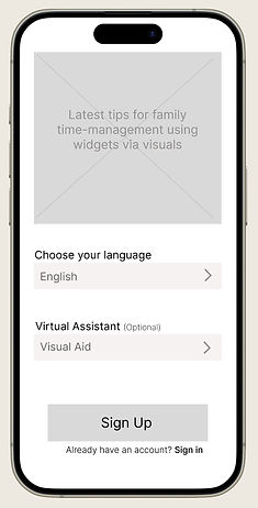
This box will include visuals expressing an interactive lifestyle using the app, eliminating the need for lengthy explanations and enhancing brand identity.
Additional features added to adjust the app for the user before they begin creating an account or signing in.
The language feature is preset to English, and the Virtual Assistance feature is preset to "none" or left blank. However, this example demonstrates an option being chosen.
09 FINAL REVIEW
Recommendation 1:
Conduct further accessibility research to evaluate improvements made and identify additional needs after implementing the virtual assistant feature.
Recommendation 2:
Encourage frequent use of the prototype to identify popular features and navigation patterns. This will help refine the app by removing unnecessary elements and simplifying the user experience.
Recommendation 3:
Record users interacting with the app in real-life scenarios to uncover ways to enhance the app's functionality and effectiveness as a daily tool.
Action Plan - Next Steps
This action plan outlines practical steps for improving app accessibility, usability, and real-world integration. It emphasizes inclusive design, data-driven iteration, and user-centered testing to guide future development.
Hi-Fi Prototype - Round 2
The prototype began sleek but lacked engagement and brand cohesion. Based on feedback, I’m simplifying visuals, refining layout emphasis, and unifying the color palette to create a cleaner, more intentional, and engaging experience.
10 LESSON LEARNED
Hi-Fi Prototype - Latest Revision
Based on user feedback, I refined the branding for clarity and warmth by using a calming color palette, larger fonts, and more approachable UI elements. Rounded buttons, outlined icons, and pastel illustrations now support a clean, family-friendly interface, while unnecessary screens were removed to streamline the user flow.
Lesson Learned
This project taught me that over-designing can be just as harmful as under-designing. I added features and visuals that distracted from the core problem, only to realize simplicity is often the smarter, more empathetic choice.
I also made the mistake of designing without consistent user feedback, which led to assumptions I couldn’t validate. Moving forward, I’ll prioritize earlier testing, clearer scope, and restraint — all lessons earned the hard way, but ones I’ll carry into every future project.